Boundless represented an entirely new, and liberating, way of building for the web. Beyond what is possible with established no-code page builders like Squarespace or Weebly, Boundless combined page building, a deeply integrated data back-end, and the connective layer of logical workflows to enable the creation of fully-featured, user-based, dynamic apps — all without requiring any code or special technical knowledge.
I served as Boundless Labs’s Lead Designer, and sole designer, meaning my responsibilities were wide-ranging, from identity and marketing design to user interface, information architecture, and overall product experience. My most salient achievements at Boundless were at the points where UI detail met more abstract system design. In detailed brainstorming and problem solving with the small team, we created a novel system of expression — a coherent platform for building quite complex web apps — and my overriding concerns were that the system be consistent, intuitive, and powerfully open-ended.
Boundless could be described as, in a sense, combining the page building of a tool like Squarespace with the spreadsheet-style data management of Airtable, then connecting everything with the visual workflows of Zapier. In first starting my work at Boundless, I researched these and many other tools in related spaces, identifying common interaction patterns and pitfalls. The task for Boundless was to design an abstract model that would fit a wide variety of possible web applications, incorporating elements like pages, forms, data, user roles, record updates, and workflows — and keep to designs that were simultaneously straightforward, guarded against large mistakes, but maximally flexible and expressive.
The overarching model was of three pillars: Pages, Workflows, and Tables. These corresponded to the key aspects of any app: presentation, logic, and data. My design goal for Boundless was to enable users to move freely between these three areas, emphasizing that they were simply three views into the same app. As an example, a form on a page, say for a new user account, is tied to an equivalent User table on the data side. Creating the form on the page would automatically create the table. But the user could just as well create the table first, then later place a form on the page modeled after the table. Our method of referencing data on a page — through variable pills called boundles — is just as usable within workflows or tables, and can be learned wherever it first is needed. This philosophy of meeting the user where they were, and capturing intent without introducing friction, was laced through all my work at Boundless.
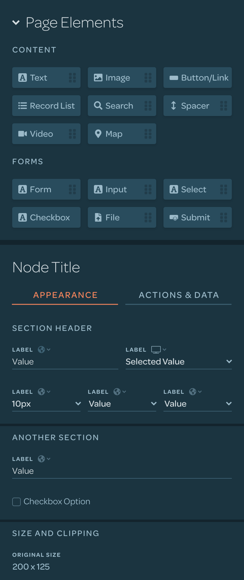
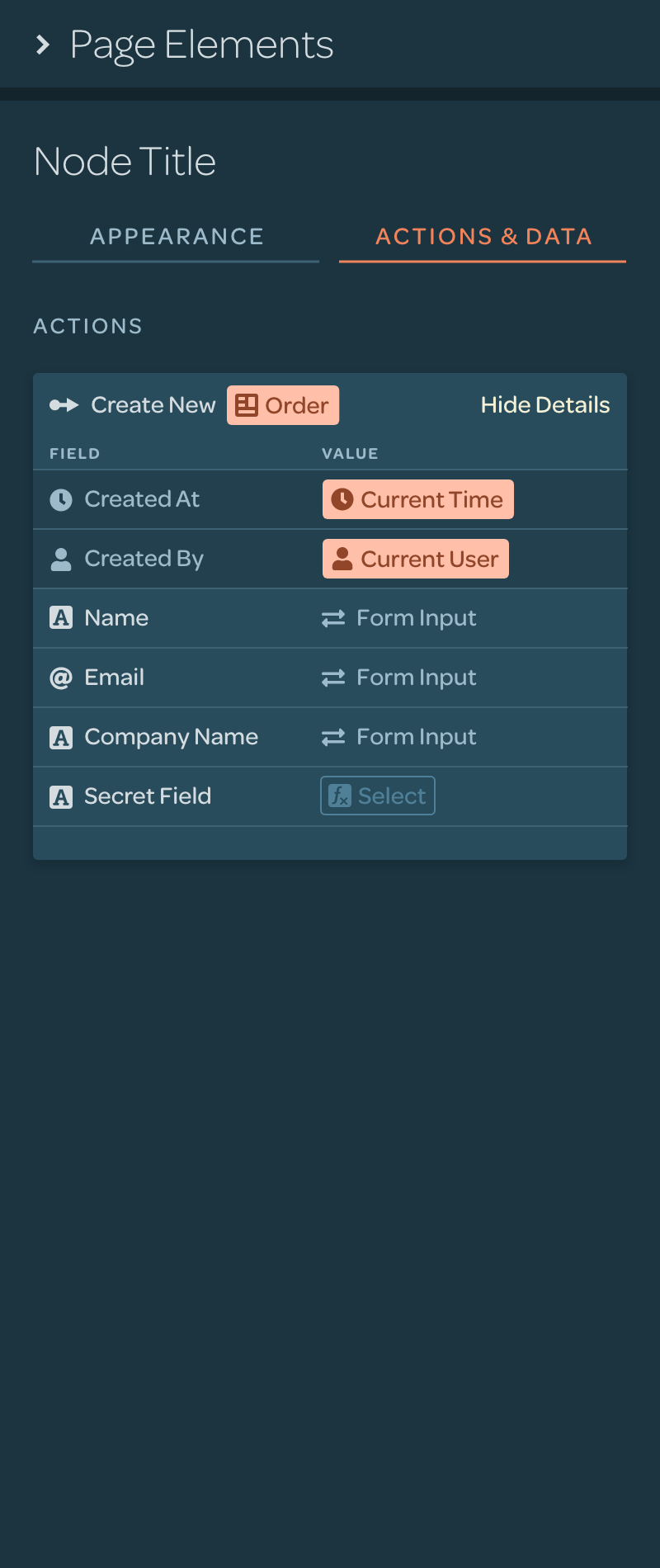
The Boundless page editing interface
A significant part of my job was to push the engineers to go even further to create a truly polished, designed product. It’s common for engineers to ship with rough interactions in the interest of moving quickly, whereas I was there to highlight the hazards of design debt and advocate for not just design polish in the near term, but setting a path to make our next features that much easier to implement.
My work at Boundless touched every aspect of the system, and ours was a small, fast-moving team, leaving little time for the design formalities that benefit larger companies. To that end, much of my design work involved just-sufficient comps in XD or Figma, live discussion and pairing with the engineers, and at times, of course, much more detailed specifications. What follow are just a few examples of this design work; the best showcase was, of course, Boundless itself.


The Logo
Initially, Boundless was known as Orchard, a temporary name and brand that the company knew it wanted to replace. When we decided on the name Boundless, which reflects the open-ended, expressive nature of the platform, we knew we needed a logo which simultaneously conveyed simplicity, approachability, and open-endedness.
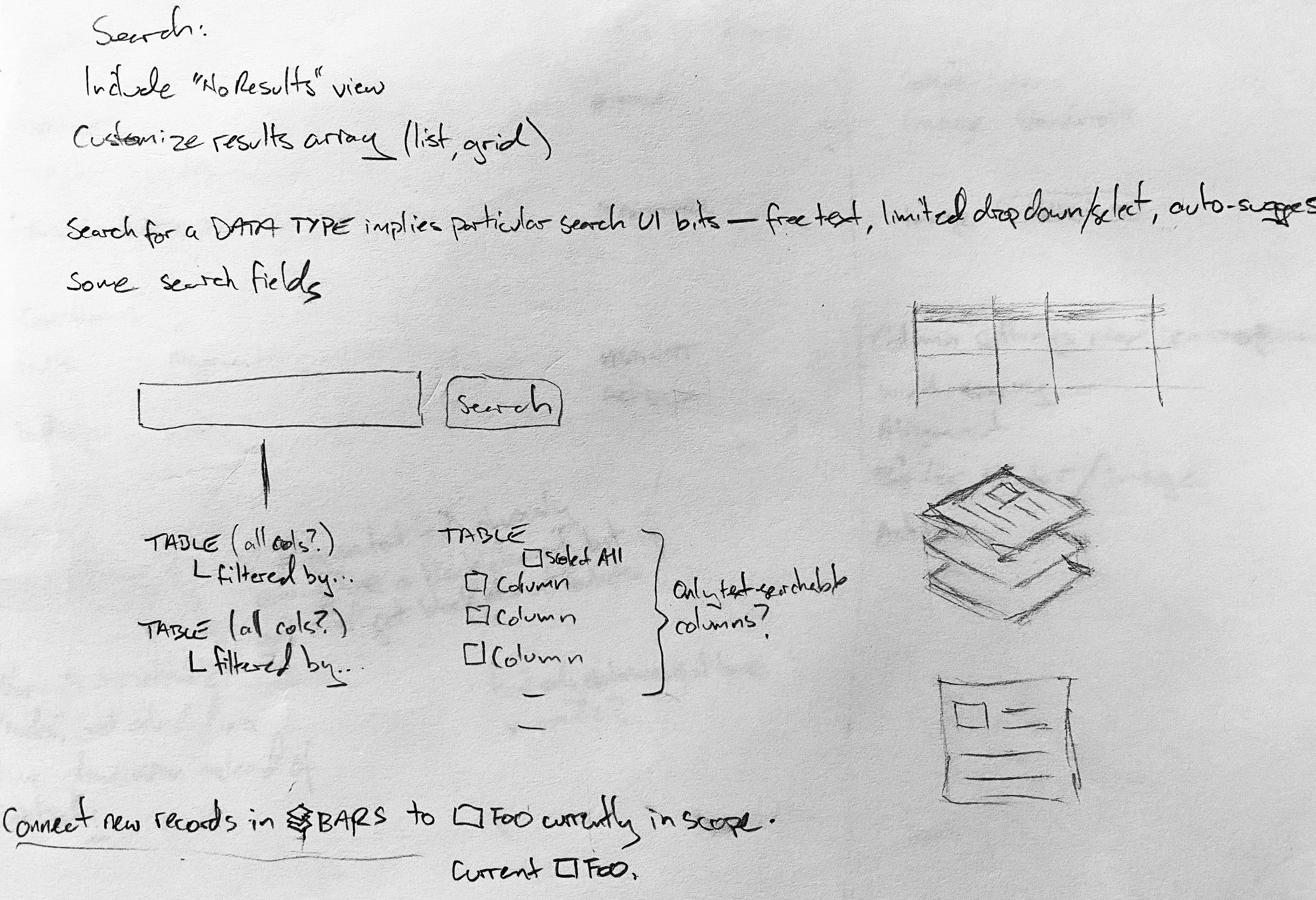
In initial rough sketches I played with how to allude to Boundless’s workflows and system-building qualities, experimenting with network, “play” button, and arrow motifs. We also looked at what would represent an open sky. We found airplanes already overused in logos, not to mention suggestive of email software, so we considered a hot air balloon as one direction.
Initial logo sketches
Ultimately, however, the strongest direction was one of the simplest: a “B” in rounded sans serif type, surrounded by an incomplete — unbounded — circle. As I refined and finalized the mark and logotype, I focused on maintaining simplicity while keeping it immediately recognizable. Its round, inviting shape lent itself to layouts suggesting a balloon, a punctuation mark, or a confident stamp of completion — a sort of copyright symbol for a sophisticated app built with Boundless.
Boundless logo specifications
A sticker sheet for NoCodeConf 2019
The Power of Variables
Because every Boundless app had data built-in, it was crucial that that data be available throughout the app’s structure, whether in page layout, workflow logic, or even as input into new data. The concept for this is familiar from programming: the variable — a way of referencing a value that might change depending on various conditions. In Boundless, we decided to call these boundles.
A call-out on the marketing site introduces the power of boundles
In initial research and ideation for boundles, I considered well-established patterns in both programming IDEs and in spreadsheet software. Looking carefully at the variable treatment and formula function of utilities like Excel, Numbers, and Google Sheets revealed a common pattern of visual encapsulation of a variable. Adding to these the auto-complete interaction from IDEs suggested a direction for entering the contents of a boundle.
Working closely with engineering, I developed an interaction model designed to be both discoverable, for initially learning how to use boundles, but at the same time, quick and unobtrusive once the pattern was known. In many parts of Boundless, typing “=“ triggers the start of a boundle, which is quick once you know the shortcut. To aid in discovery, we presented an “Insert Data” affordance to page text editing and certain fields. Clicking it simply inserted “=“ for you, demonstrating that typing “=“ is all it really takes.
Once in boundle edit mode, a dropdown menu serves multiple functions. Initially, it displays current data scopes (such as Logged In User, or a particular order record), as these are among the most commonly referenced bits of data. Start typing, and the dropdown switches to a dynamic auto-complete system, assisting the user in traversing their data’s hierarchy. The user’s input may also match any number of powerful functions, modeled after common spreadsheet formulae, at which point help text is shown.
Design specs for boundles — the Boundless system of data variables
Boundles could include powerful formula functions; we included in-context help
Boundles were powerful, and the interaction we'd developed made them smooth and intuitive to use in the context of building an app. We felt confident about that, but we remained concerned with how to convey this power to potential users who weren't yet ready to start building a site. In response, I designed the Boundless Playground: an addition to our marketing site which allows visitors to experiment with how Boundless handles data and its presentation in pages, and the tight, intuitive connection between the two.
The page offered three functional zones: a "window" into Boundless table data at the top. and then side-by-side display editing and resulting output — inspired by coding playgrounds built into various IDEs. In one view, it's easy to see the relationship between back-end data, page builder definitions and boundles, and the resulting display.
An Intuitive Data Back-end
Every Boundless app is backed by data: whether it’s a store’s inventory, a service’s customers, active orders, or store locations. While much of the data will be generated as users fill out forms, place orders, and otherwise interact with a Boundless site, it was important to offer a powerful interface to work with data directly. This needed to include table creation, connecting records (effectively creating relational databases), querying and sorting data, and adding, editing, and deleting as necessary. As one of the primary facets of a Boundless app, the Tables section became a powerful tool in its own right.
At the highest level, my design presented the potential complexity of data models through a familiar pattern: the spreadsheet. While Boundless tables aren’t perfectly analogous to spreadsheets, enough similarities hold that I could leverage columns and rows, sorting controls, formulas, and a tabbed view interface as an intuitive structure.
Our Public Face Online
For the second iteration of the Boundless marketing site, I created a more open and inviting design, with careful use of color and space to reflect the approachability of Boundless itself. Notably, the site had to be designed and implemented within a relatively short timeframe (about two weeks) in order to meet new marketing goals.
Before worrying about the actual look, I led the team in brainstorming what content belonged on the page. We then prioritized key sections: a top hero message, secondary hero features, the three pillars of the Boundless app, testimonials, etc. Keeping each in mind as modular and changeable allowed me to piece together the page flexibly, and quickly.
In the actual design, I created areas of focus, using white space generously to reduce clutter and allow each section to speak for itself. Rather than relying on illustrations as we had in the previous version of the site, our “three pillars” section used large screenshots of the app itself. Interjected a few times on the page are call-out sections, either to highlight additional features, such as the three-column interjection below the hero, or the section describing boundles, our versatile variable system.
Because the site was implemented in Boundless itself, adapting the design to tablet and mobile layouts was straightforward, with only small adjustments to font size and spacing needed.